
Salesforce case study part 2
The fix leadership rejected in 2012, and the data that got it approved in 2013.
CRM
Enterprise
B2B
1→2
ROLE
Lead UX Designer
COMPANY
Salesforce
TIMELINE
2013
TEAM
Solo, ENG, QA, PO, Scrum
BY THE NUMBERS
23 fields to 8
the same fix rejected in 2012
50%+ fewer
support calls after redesign
$100k+ saved
in call center costs for Dreamforce 2013
Visuals: Before and After
2012: 23 fields
Close up
2013: 8 fields
The Problem
The 2012 form was still costing money.
Dreamforce 2012 shipped with 23 mandatory fields on a single registration screen, and the session reset entirely after 15 minutes of inactivity, forcing users to start over. More than half of Dreamforce's customer service calls traced back to registration difficulties, a direct, measurable cost that leadership hadn't priced into the 2012 decision.
Role & Constraints
OWNED
Modernizing the registration and account-creation flow to the 2013 style guide, reworking flow, interactions, and performance for desktop and mobile.
PARTNERED ON
Developers, QA, a product owner, and a scrum master throughout the rebuild.
CONSTRAINTS
The same 23-field design flagged as a risk in 2012 was still live and generating call volume.
WHAT CHANGED SINCE 2012
Full-time employment status, and a year of measurable call center data tying friction directly to cost.
The Approach
4 steps, one vision.
1. DISCOVERY: Pulled a year of call center data tying registration friction to over half of all support calls.
2. DEFINITION: Set a target of 8 or fewer required fields, in line with established usability guidance.
3. DESIGN & ITERATION: Built task flows, wireframes, and clickable prototypes for desktop and mobile with QA and engineering.
4. DELIVERY: Shipped the reworked flow ahead of Dreamforce 2013, alongside the refreshed style guide.
Key Decisions
Same fix. Different pitch.
The fix
Cut required signup fields from 23 to 8
Why:Over half of support calls traced to registration friction, and this was the exact recommendation rejected in 2012.
Result: Registration-related support calls dropped by more than half, and call center costs fell by roughly $100,000 a year.
The pitch
Led with a year of cost data instead of the design alone
Why: The same recommendation, presented without numbers attached, had been overridden the year before.
Result: The proposal was approved and shipped, and the flow has stayed in production largely unchanged since.
Visuals
Dreamforce 2013 registration flow
To navigate: drag with mouse, use your left or right arrow keys, click the blue arrow icons, or swipe with your trackpad
-
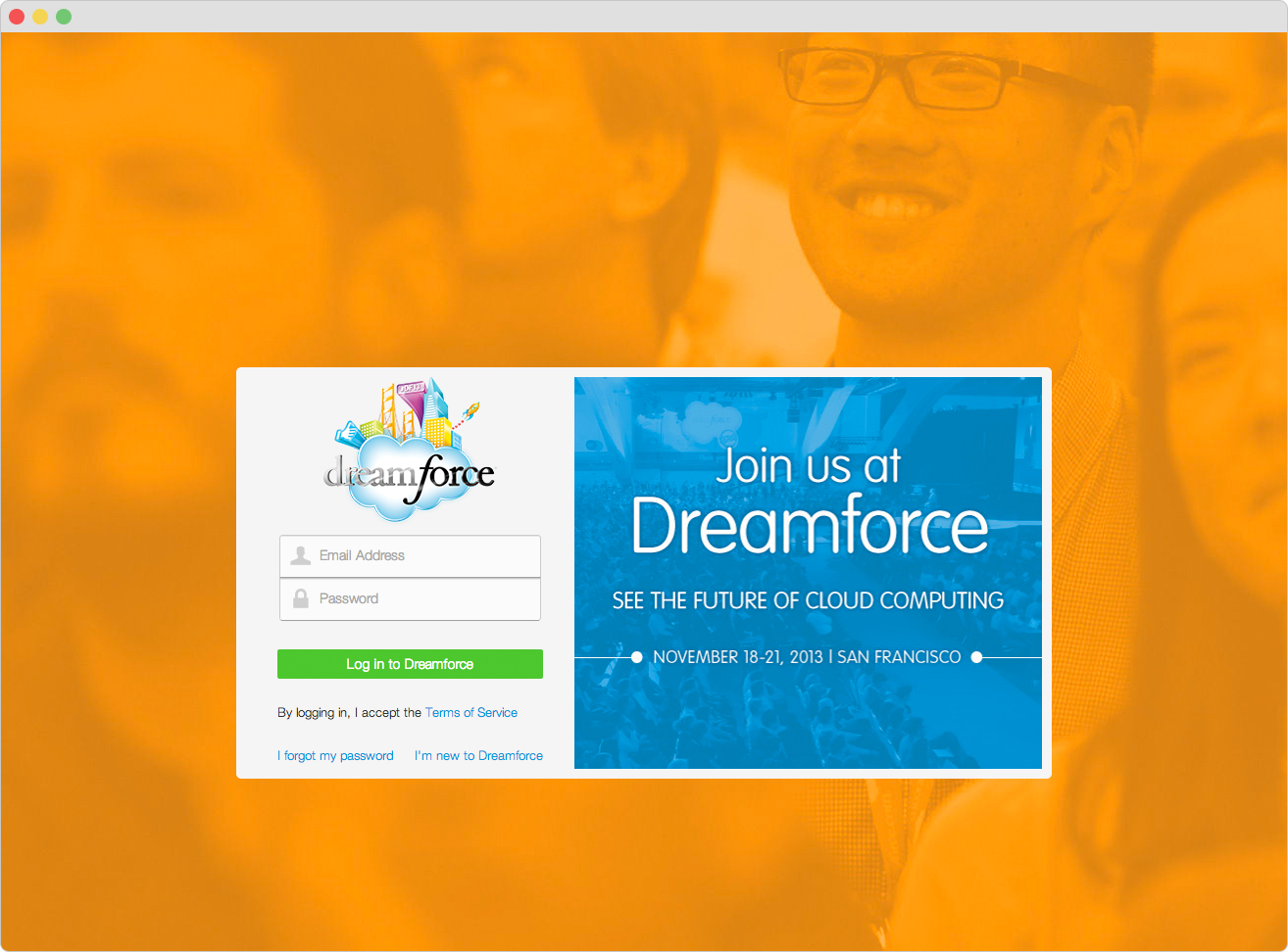
![Screenshot of a login page for Dreamforce conference, with a blue section promoting the event in San Francisco from November 18-21, 2013, and a white login form on an orange background showing smiling people.]()
1. Dreamforce Registration Home
Login, retrieve password, or create an account to continue.
-
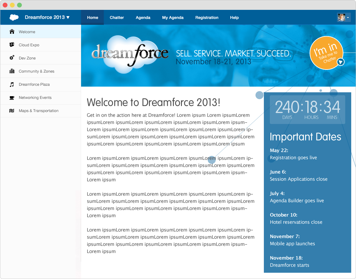
![Screenshot of the Dreamforce 2013 conference webpage with a sidebar menu, a countdown timer, and a list of important dates.]()
2. Welcome
Event description and important details.
-
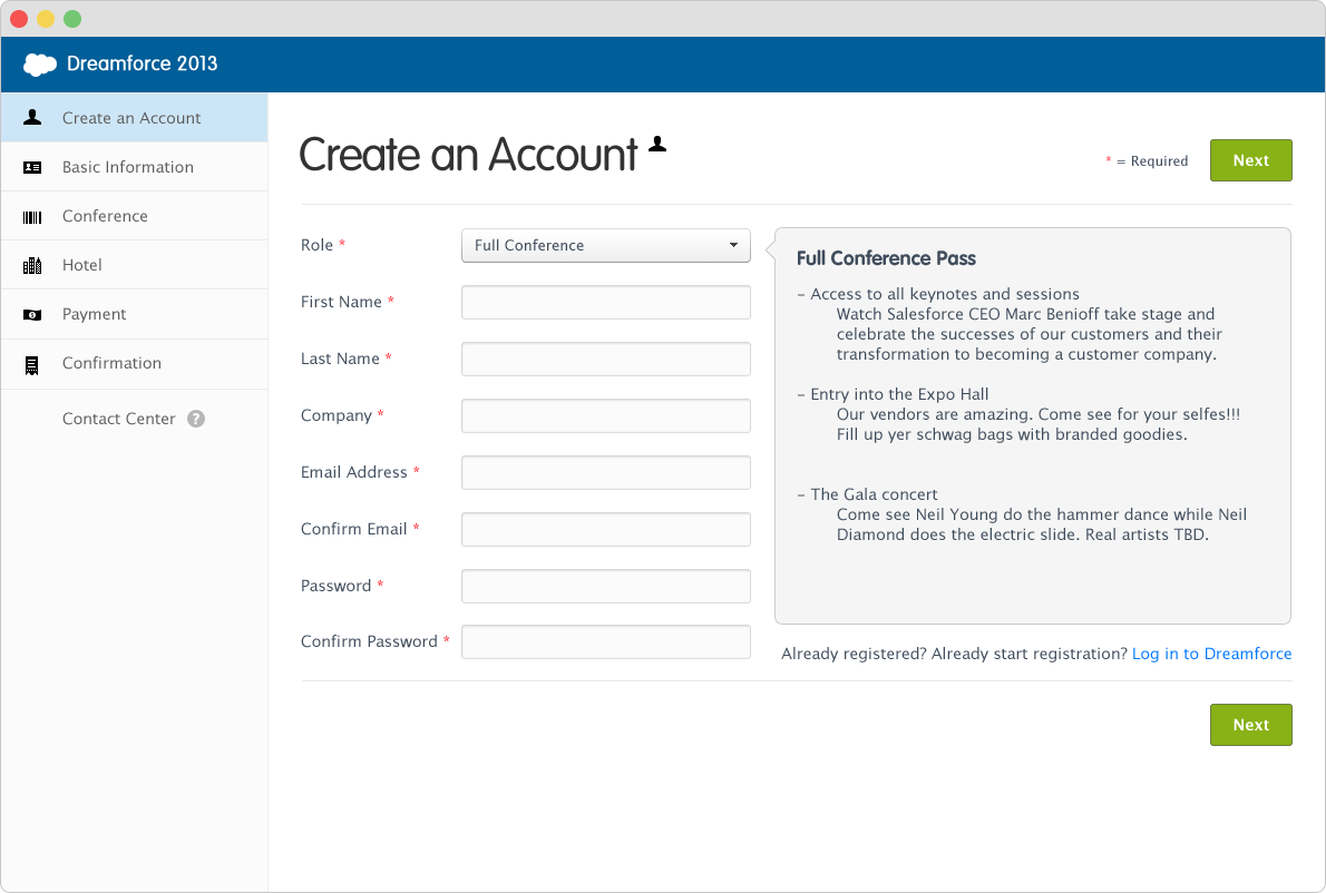
![Screenshot of a web page titled 'Create an Account' for Dreamforce 2013, showing a registration form with fields for role, first name, last name, company, email address, confirm email, password, and confirm password, with navigation options on the left for conference, hotel, payment, and confirmation sections.]()
3. Create Account
Enter information to create an account.
-
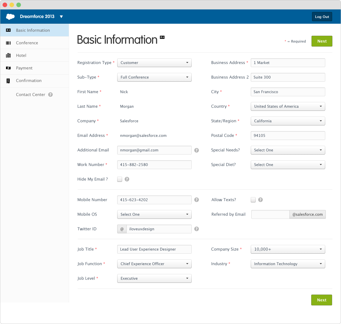
![Salesforce registration form with personal and professional details including name, address, contact info, job title, and industry.]()
4. Basic Information
After the account is created, enter detailed information.
-
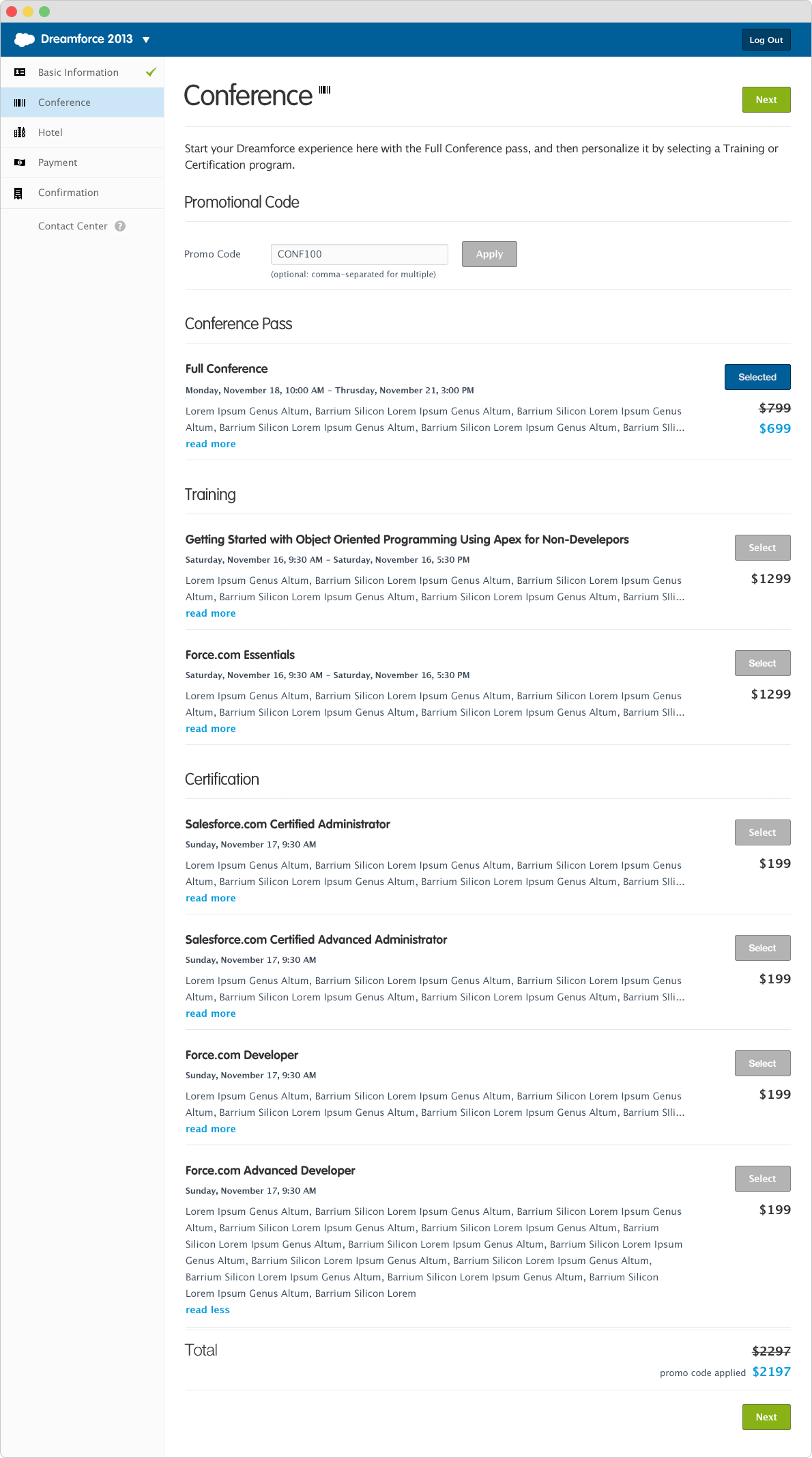
![Screenshot of a computer screen showing a Dreamforce 2013 conference registration page with sections for conference, training, certification, and total price.]()
5. Additional Training and Certificates
Add any additional training or certification programs.
-
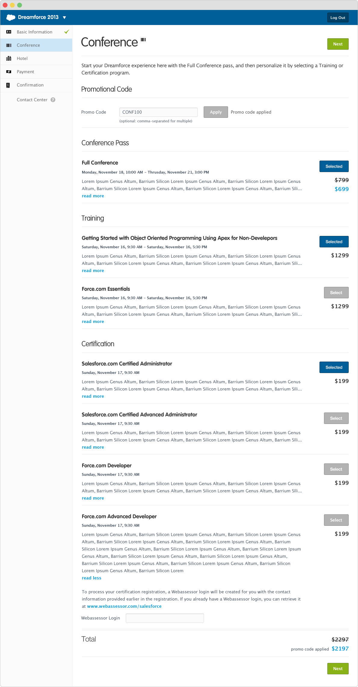
![Screenshot of a Salesforce Dreamforce 2013 conference registration webpage showing steps including Basic Information, Conference, Hotel, Payment, and Confirmation, with selected conference sessions and prices, and input fields for promo code and Webassessor login.]()
6. Additional Training Selected
One training program selected.
-
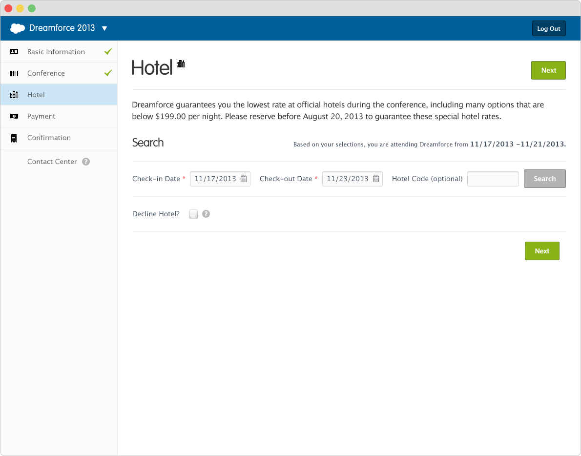
![Screenshot of a hotel booking webpage for Dreamforce 2013, showing check-in and check-out dates, hotel code input, and a green 'Next' button.]()
7. Hotel: Select Dates
Select your hotel dates.
-
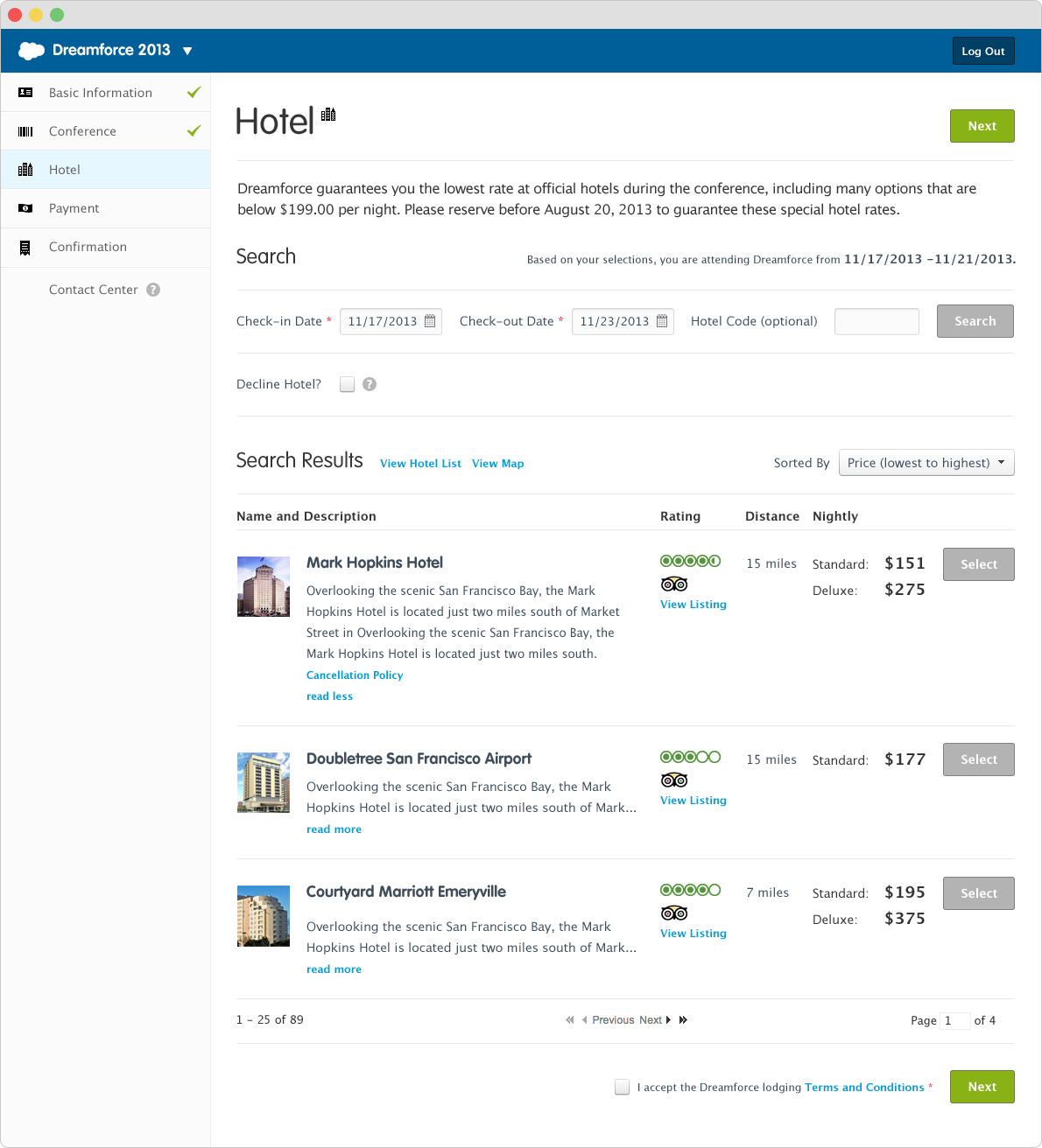
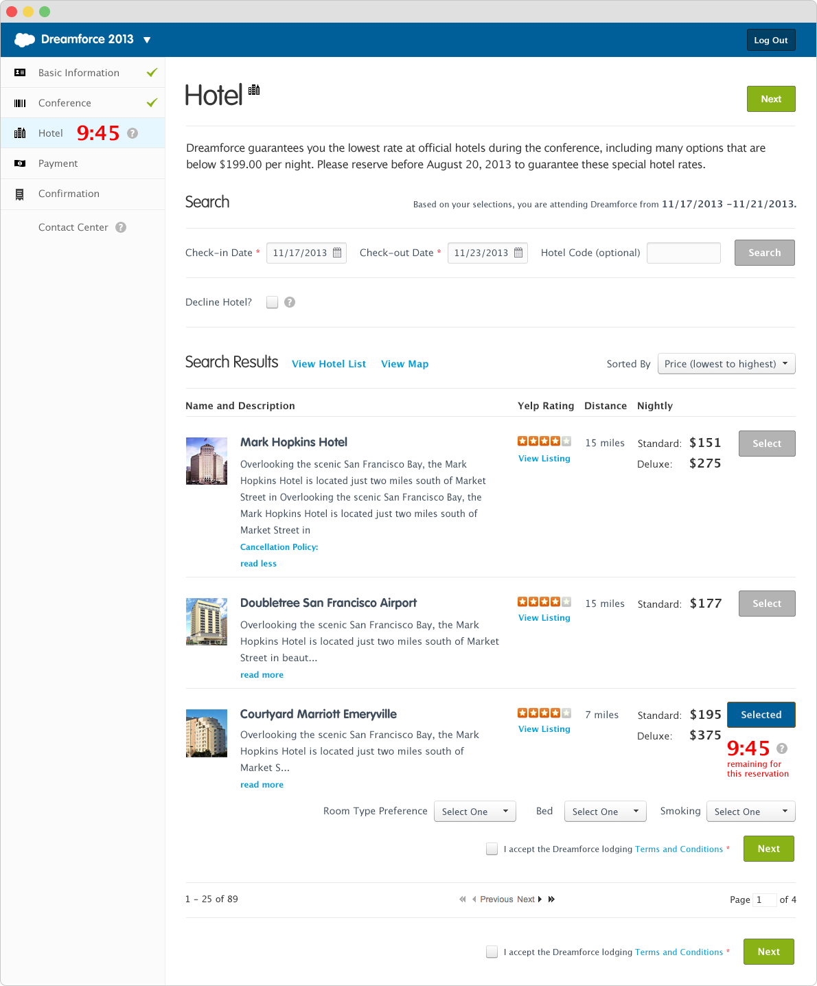
![Screenshot of the Dreamforce 2013 hotel booking webpage, showing hotel search results with four options, including Mark Hopkins Hotel, Doubletree San Francisco Airport, and Courtyard Marriott Emerville.]()
8. Hotel: Search Results
View hotel search results along with rating, distance from the event, and price options.
-
![Online hotel booking website displaying search results for hotels near San Francisco, California, with hotel names, locations, ratings, prices, and booking options.]()
9. Hotel: Hotel Selected
Once selected, it's reserved for 10 minutes to complete the transaction.
-
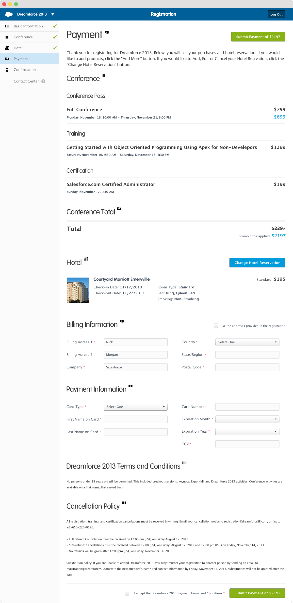
![Screenshot of an online registration payment page for Dreamforce 2013 showing conference registration, hotel reservation, billing, and payment details.]()
10. Checkout and Payment
Confirm the details and enter payment information.
-
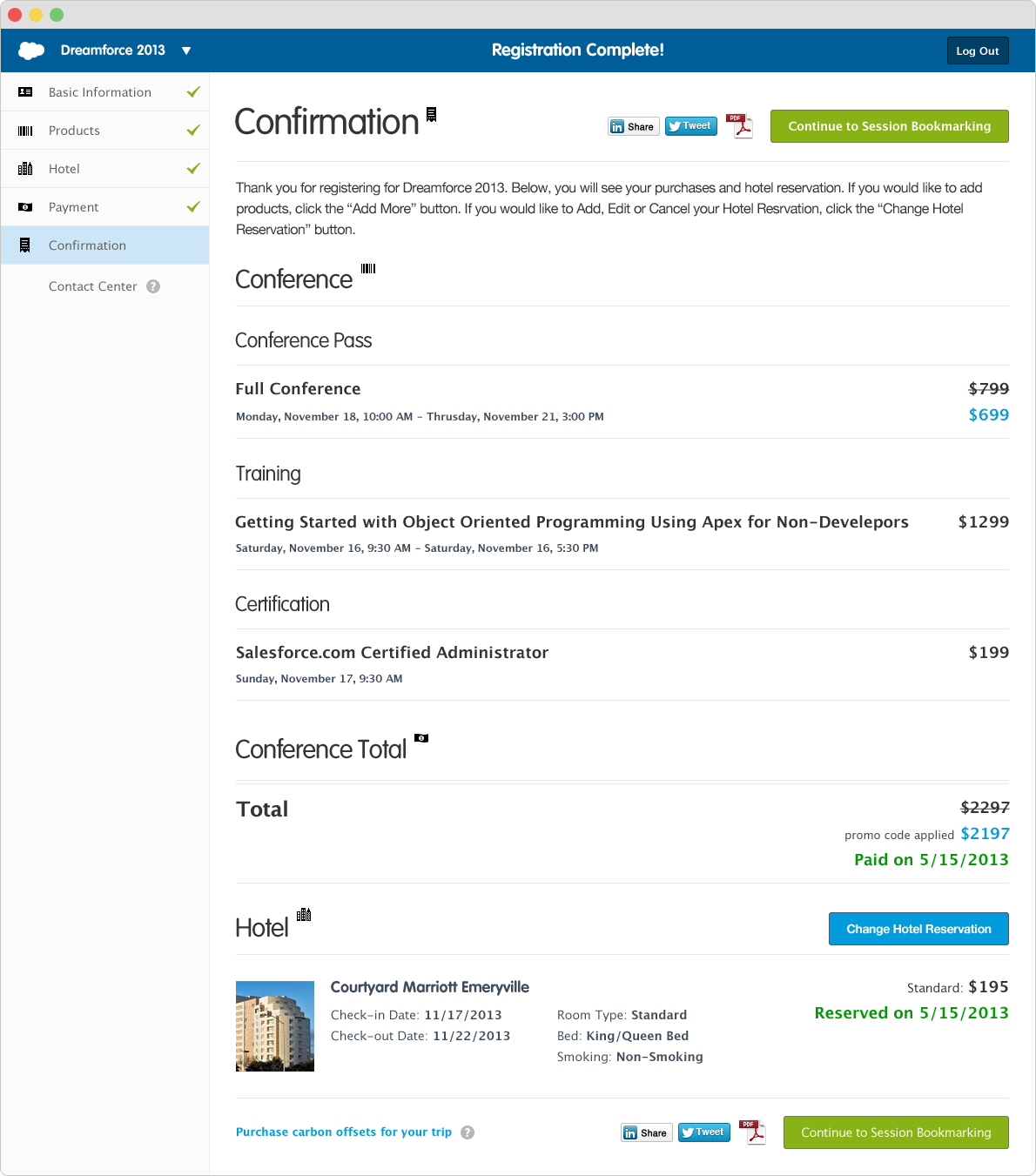
![Screenshot of a hotel reservation confirmation page showing details of a conference registration, selected hotel, and payment information.]()
11. Payment Confirmation
Payment confirmation, along with the option to download a PDF for reimbursement.
Outcome
What shipped, and what held up.
Dreamforce 2013 drew 143,000 attendees, nearly double 2012's 77,000, on a registration flow that now asked for 8 fields instead of 23. Registration-related support calls fell by more than half, saving Salesforce roughly $100,000 in call center costs, and the core account-creation flow shipped in 2013 and is still running twelve years later, as of 2025.
Reflections
The fix here was the same one I'd proposed in 2012. What changed was how I pitched it: leading with a year of call center data and usability precedent instead of asking leadership to trust the design on its own.